The Best Free Printable Resume Trends In 2021
John Doe June 9th, 2021Resumes aren’t just sheets of paper listing your credentials—they’re the ticket to your professional success. So if you want to have a stable and successful career, make sure you know how to write a great resume.
Resumes aren’t immune to trends. They come and go as years pass on. You can thank technological innovations and industry advancements for that. What you thought might be relevant today may be useless in the next few months. How does one keep up with all the changes?
If your resume is stuck in time, give it a much-needed update to keep up with the current times. These are just a few of the 2021 trends you may want to follow.
Try These Resume Trends To Stand Out
Trend # 1: Muted Colors

While vivid colors won’t go away, muted colors have become the go-to tone for designers this year. After the chaos that was 2020, we could all use something a little calmer.
Muted colors are not only relaxing, but they’re also more natural and authentic. They blend in nicely with neutrals while contrasting well with darker tones. Make your resume a little more stylish by taking a color like a pastel blue as an accent color to the classic white.
While color experimentation is tempting, remember that you’re making a resume. When picking a muted accent color, make sure it looks professional enough to be taken seriously.
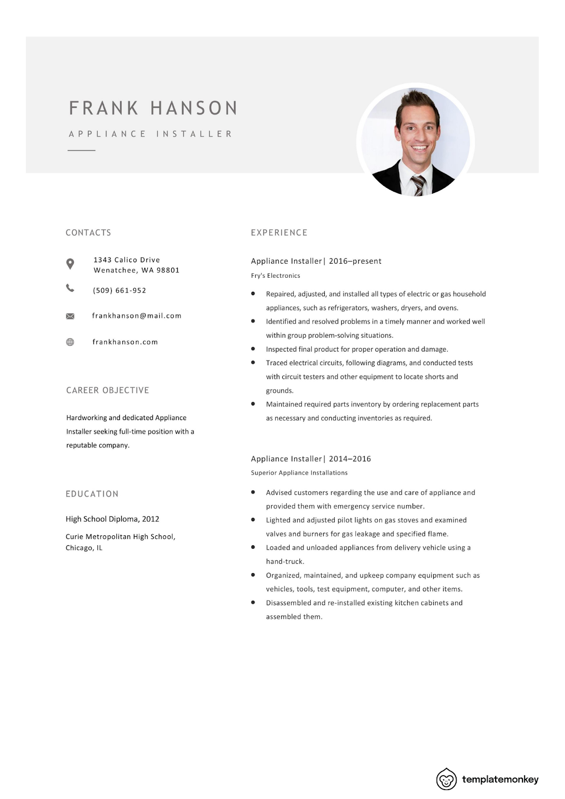
Trend #2: Minimalism
Although minimalism has been around and popular for a long while now, the “less is more” philosophy still holds up in 2021. And by the looks of it, it’s not going away anytime soon. Why? Most outputs—from websites to posters—demand minimalism. It’s safe to say that it’s a modern design requirement.
More and more designers will hold back on using many elements and increase the white space (negative/blank space for the uninformed). This move makes content more readable and digestible, earning a thumb’s up from marketers everywhere. In the context of resume building, minimalism makes your information easier to scan, making recruiters’ jobs a little less stressful.
Trend #3: Data Visualization
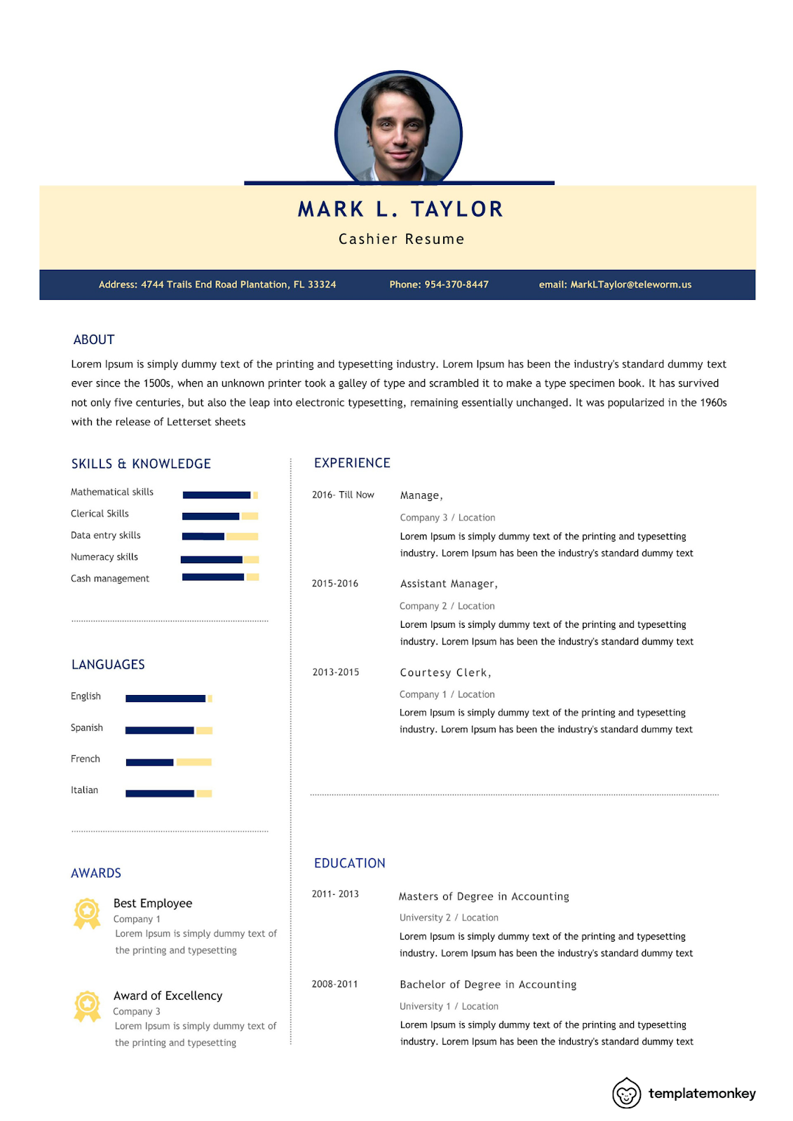
Quantifying information on resumes is never a bad thing—it’s even recommended. Numbers give people something to base on. However, merely stating them isn’t going to cut it in some sections.
Resumes are all about showing rather than telling. Instead of overloading hiring managers with data and losing their interest, cut the noise and simplify relevant data with charts and graphs. They get points across much quicker and are easier to understand. Resumes look cleaner when they’re around too.
Do note that you don’t need to do this in every section; just use them in relevant areas to avoid possible misinterpretation.
Trend #4: Geometric Shapes and Patterns
Many designers have shifted from abstract shapes and went with geometric ones instead. Compared to the former, they’re easier to create and utilize. They also make designs look more cohesive and cleaner.
Don’t let their rigid look fool you: geometric shapes and patterns are pretty versatile. They work with almost anything, from ads down to apps. You can even use them on your resumes! They look great in and with any color—especially when you use muted colors. Their structural nature plays well with softer elements, creating a stunning contrast. Use the shapes in areas like headers to make your document stand out from the jump.
Trend #5: Flat Icons
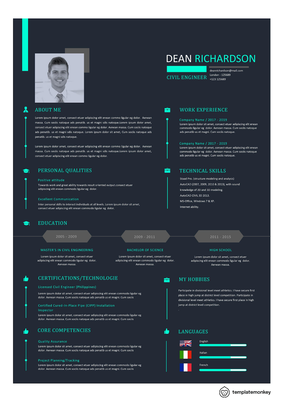
We’re all aware that resumes only have limited spaces to work with. Cramming everything into one area is a deal-breaker for recruiters and hiring managers. So, how do you indicate all your necessary information without overstuffing?
Use icons. They tell a lot about something without saying anything.
You may be wondering: do icons belong in resumes? The answer is yes. Not only do they save you a ton of space, but they also make information easier to understand. However, do remember that they aren’t always appropriate in every section and industry. Play it safe and smart by knowing where and when to add them.
Trend #6: Monochrome and Duotone Schemes
Are monochrome and duotone palettes new? No. However, they’ve gained traction in modern design, becoming a hit with designers. They like using these two schemes since they’re a lot simpler to execute. For consumers, they take lesser time to digest, avoiding potential sensory overload. Who likes looking at a mishmash of elements?
Not only do monochromatic and duotone visuals look pretty, but they also help achieve structure, harmony, and cohesion. This paves the way for relaxing and uniform looks. Resumes can benefit from these two schemes since they won’t distract from the content. Just make sure to pick the right colors, okay?
Trend #7: Columns
Remember what we said earlier about stuffing everything into one space? Again: don’t do it! The last thing you want is a cluttered resume.
Long resumes aren’t the norm anymore. Employers only need around 7 seconds to read them, so every bit of content counts. If they’re too long, they’ll just end up in a pile of rejects. How can they be convinced to give you a call within such a short time frame?
Cut the fluff out and use columns. They’re a clever and crafty solution for getting around space issues. You can place shorter sections (contact information, for example) there to keep everything organized.
Trend #8: Minimalistic Heavy Fonts
Fonts aren’t left out in modern design’s evolution. This last trend features a change that bucks previous fads.
Going by their name, heavy fonts look and feel big due to their bold appearance. They’re perfect if you want something subtle yet huge. The contrast they generate will catch anyone’s attention since they’re noticeable. Make sure your font faces are simple for maximum impact.
For your resumes, use them in shorter texts and sections like headings. This emphasizes specific areas without being too much of a distraction. Be mindful of the font size as well; you don’t want your resume to look wonky, do you?
We hope these trends will help you in your resume-building process. You don’t have to follow all of them at once—just pick and choose which ones you’re comfortable with, and work from there. Good luck!
- Money Saving Guide on Travel by Using Credit Card Rewards, Loyalty Programs, and Travel Hacks - 9 April 2024
- Amazon India Coupon & Promo Codes for February 2024 - 1 February 2024
- A Guide on How to Save Money on Winzo Game - 1 January 2024
Leave a Reply